An Rtistic walk through footballer's careers.
Another great showcase of what can be performed in R!
Background
I soon realised in my data visualisation journey that Nadieh Bremer would endlessly provide inspiration to me. I highly recommend checking our her work at Visual Cinnamon and also purchasing the wonderful Data Sketches written with Shirley Wu.
One of Nadieh’s pieces is a lovely visualisation of the digits of 𝜋, where each digit (0-9) is mapped to a compass direction, with each subsequent digit producing a new step in the corresponding compass direction (the linked blog post explains and shows this much for eloquently). The final result is a beautiful walk through 𝜋.
To adapt this concept to my interests, I decided to use a similar approach to artistically visualise footballers careers.
Footballer’s career goals
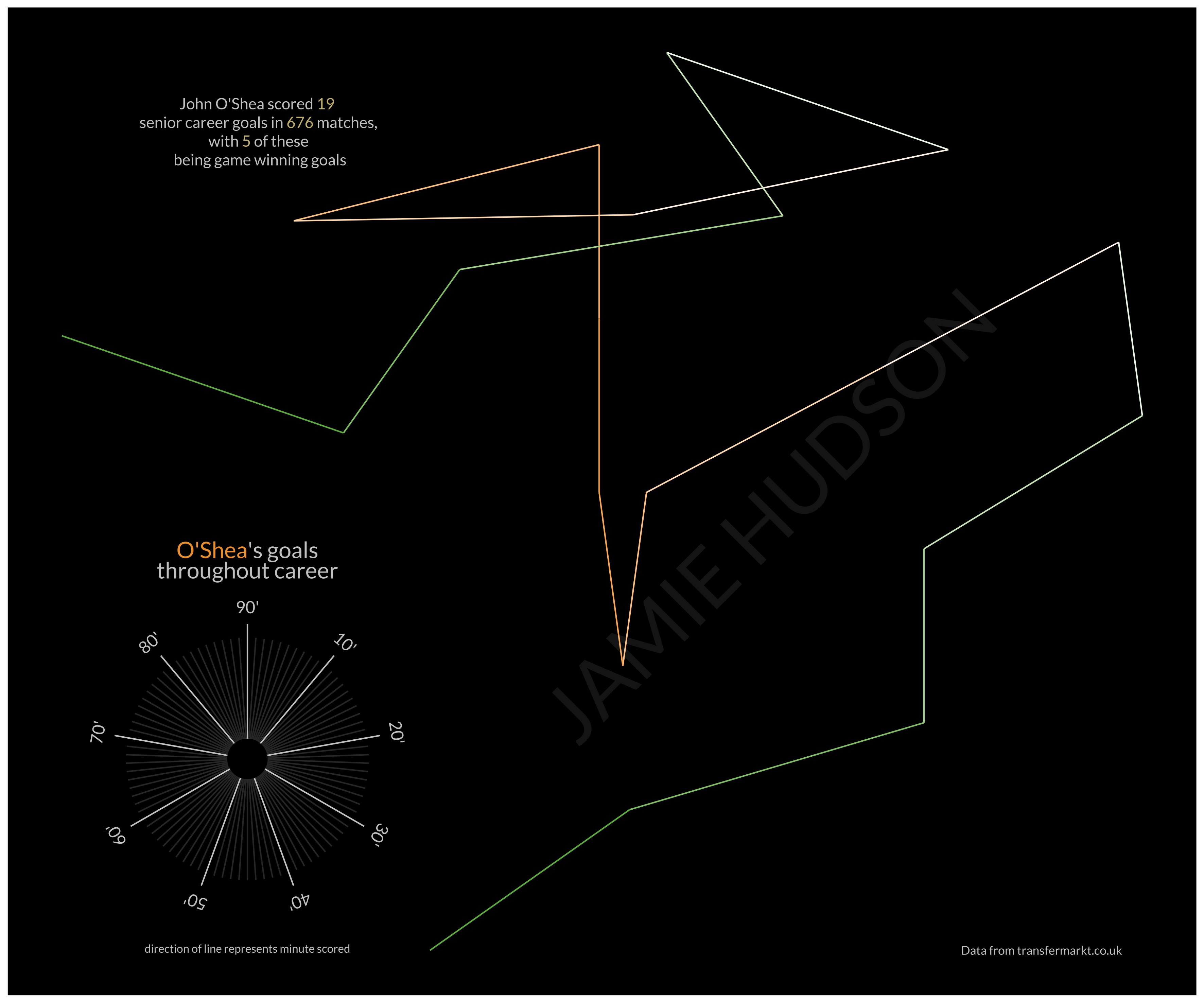
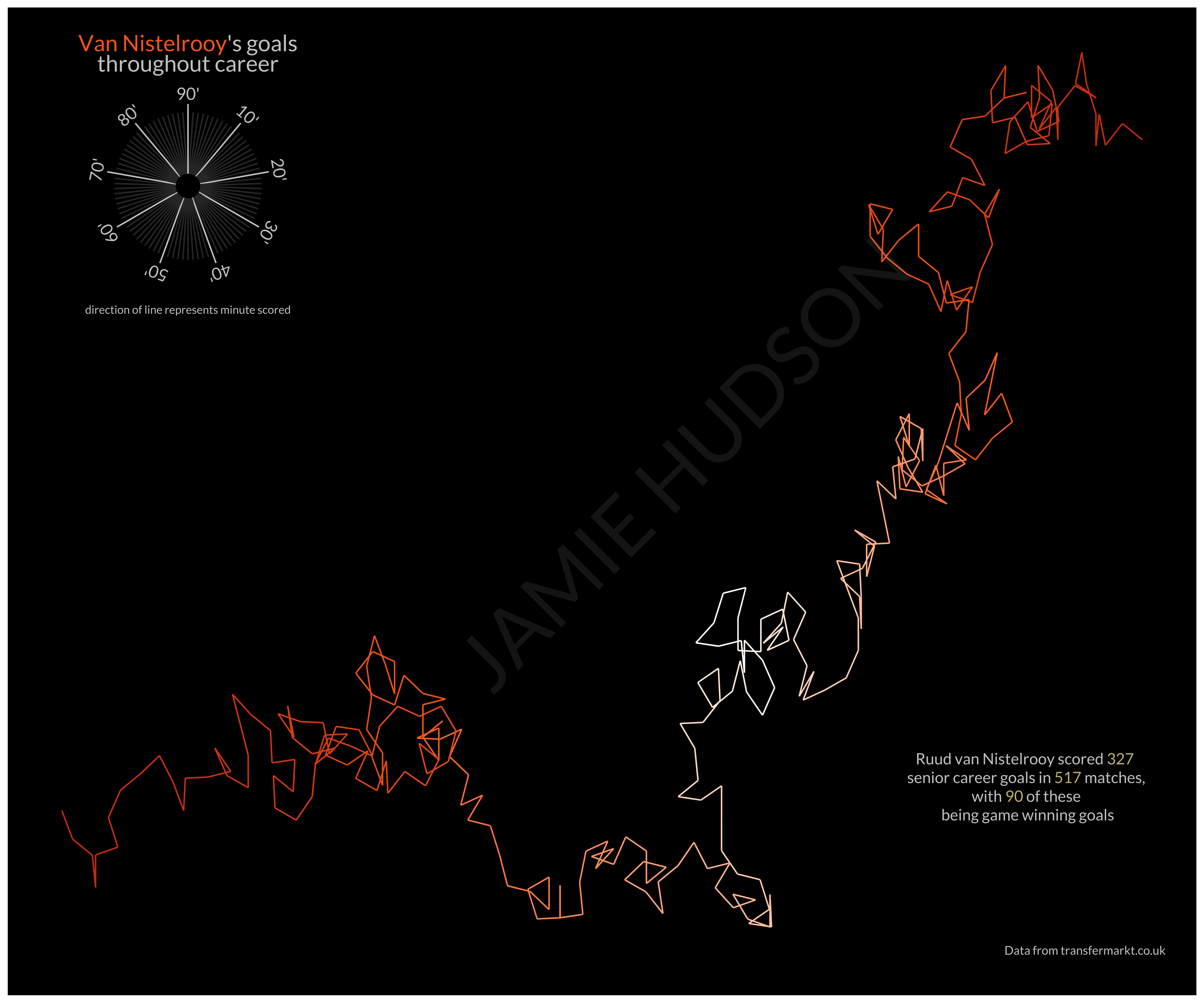
I obtained data on all of the goals that certain players scored in their club careers via the transfermarkt website, and mapped the minute of each goal to a compass direction. As transfermarkt records goals scored in injury time of both halves as 45' and 90', there are a total of 90 minutes that a goal could be scored in. This meant that each minute would represent a 4º change in direction (360º/4).
I wrangled and visualised the data using the {tidyverse} packages in R {dplyr} and {ggplot2} (where would I be without them).
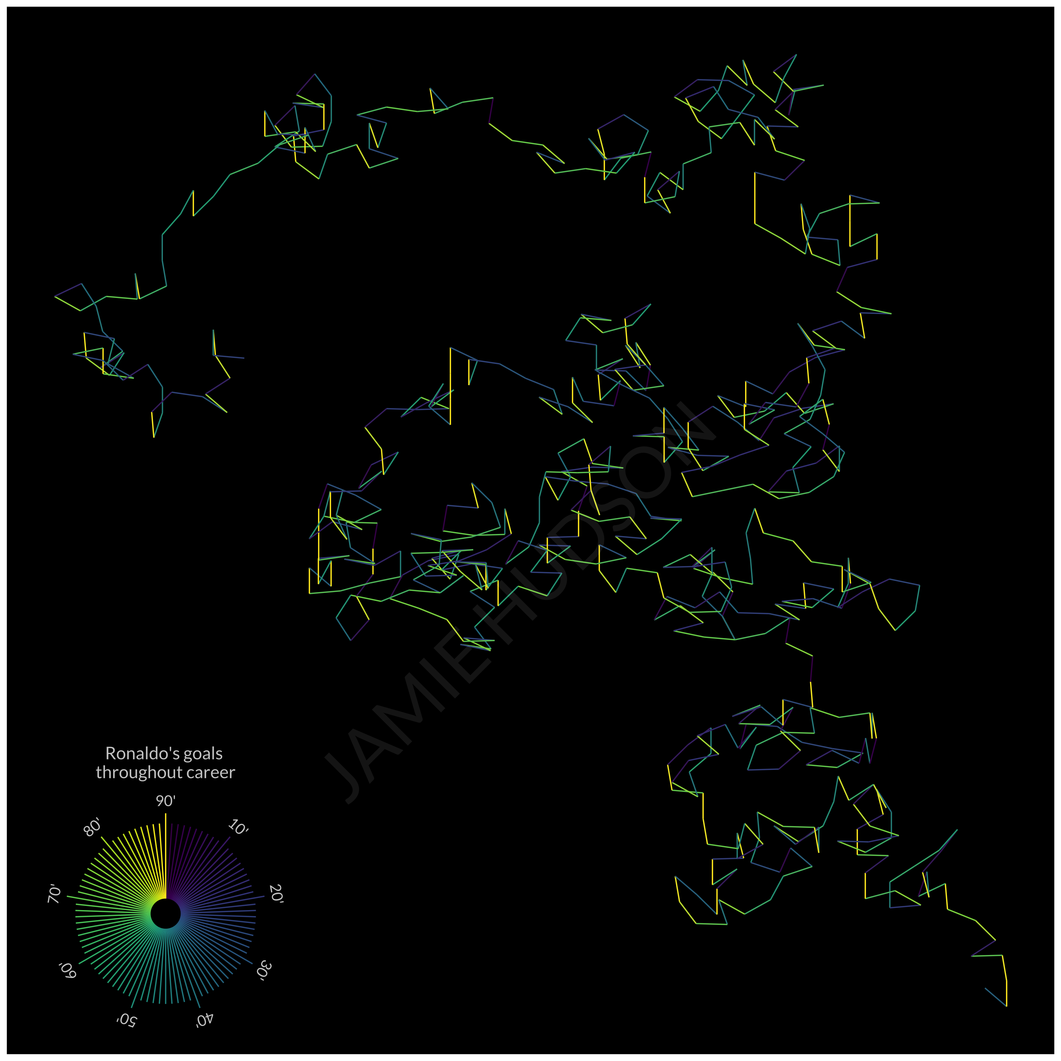
Similar to Nadieh, I played around with different colour schemes to see how these changed the visualisation. Initially I mapped colour to minute (and hence direction), though I wasn’t convinced with the double mapping of colour and direction to minute. An example of this can be seen below with Cristiano Ronaldo used as an example.
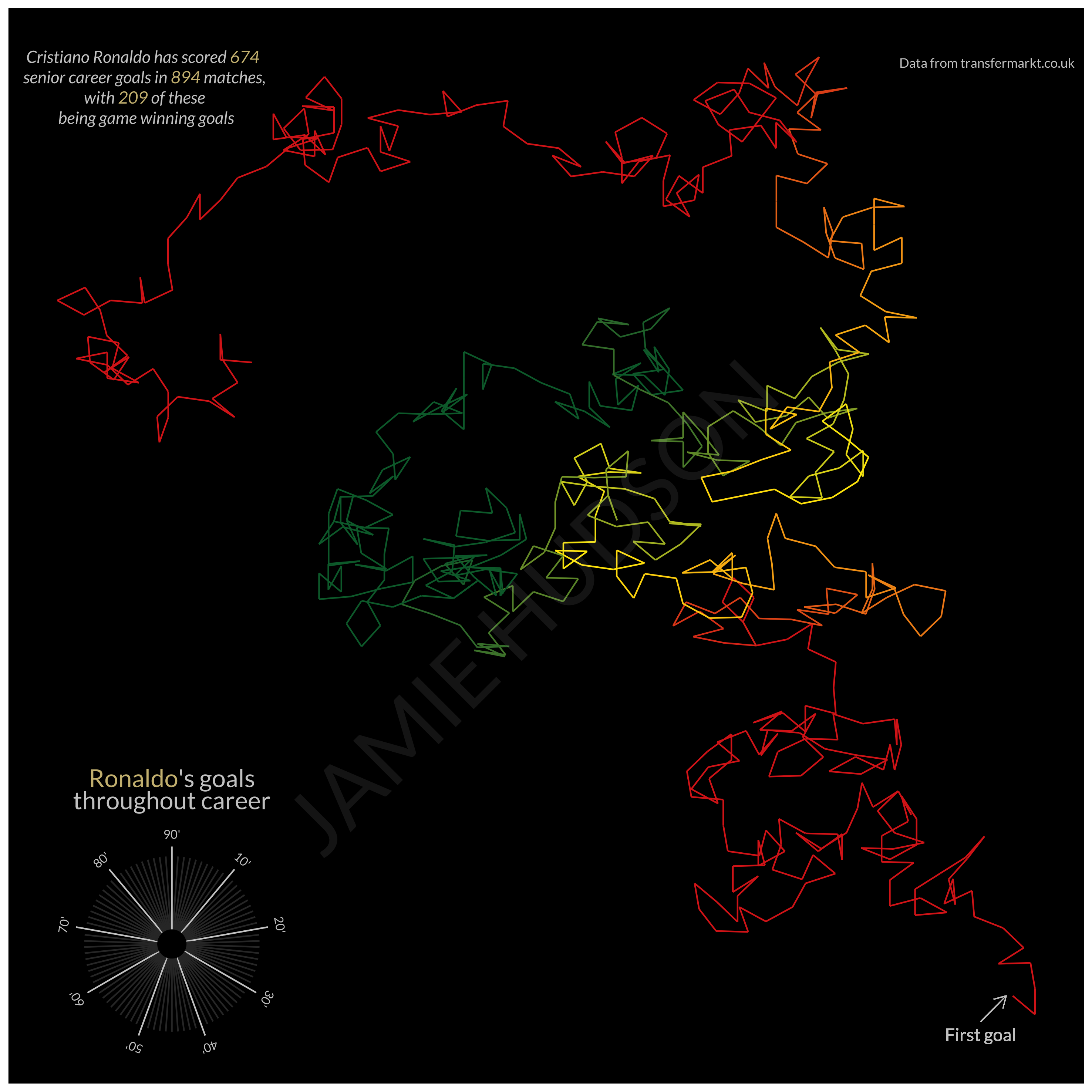
I then thought of using colour to represent additional aspects of the dataset. For example, as of the writing of this post (10 July 2021), Ronaldo has played for a total of four clubs at senior level (Sporting CP, Manchester United, Real Madrid, and Juventus). I mapped the club that he was playing for when he scored each goal to a colour that generally corresponds to each club (Sorry Juventus, Los Blancos prioritise the use of white).

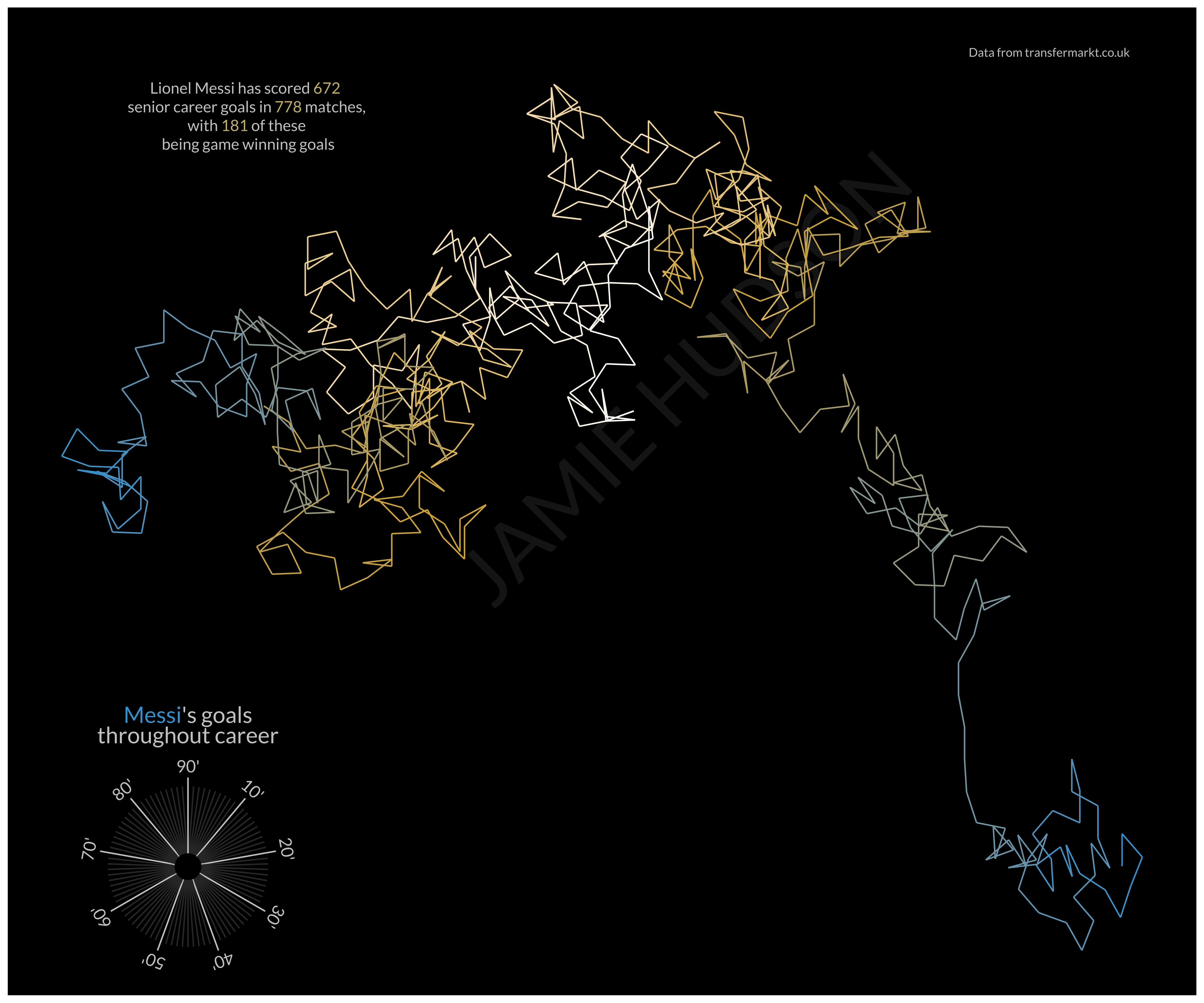
Whilst I actually think this works nicely for someone like Ronaldo who has played for relatively few clubs, if I had made this for someone like Rivaldo (who played for 15 clubs), it would get quite messy. I decided to use ggplot::scale_colour_gradientn function to create a gradient of colours, through the players career, that correspond to the colours of their national team. This, as well as annotating the figure with updatable metrics (such as the number of goals and games played) and specifying where the walk starts (first goal), produced the final version:
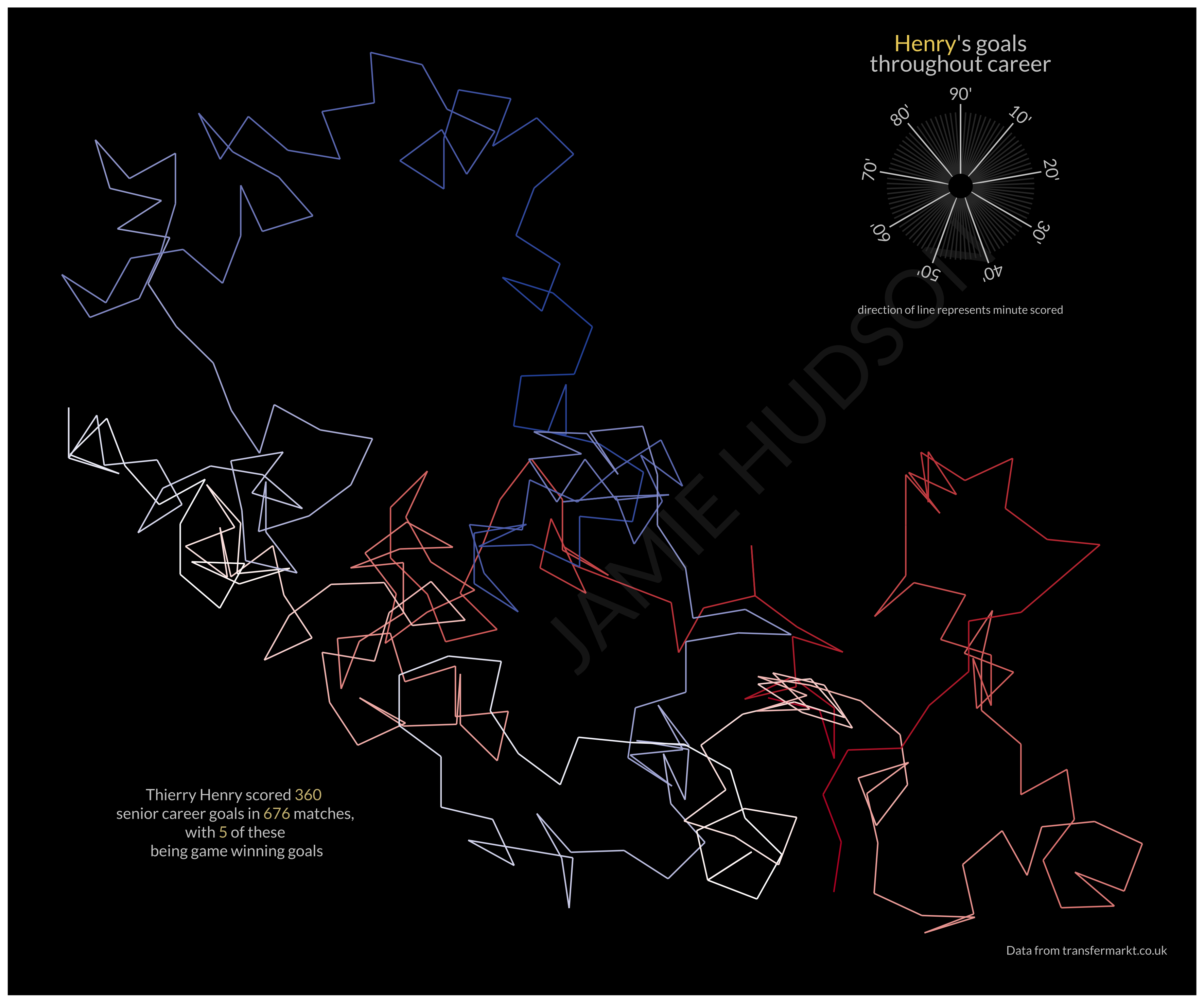
See below for a gallery of some of the players that I have created these visualisations for. As an Ireland and Manchester United, I couldn’t help but include the mighty John O’Shea in this pantheon of all-time greats.
I hope you enjoy! This is my first blog post not Marine Biology related, so any constructive comments are welcome 😊.