Mapping isochrones in {ggplot2}
#30DayMapChallenge
Unfortunately I have yet to find time to partake in the brilliant #30DayMapChallenge, an online challenge created by Topi Tjukanov, where participants aim to create a map based on a specific daily theme throughout November.
One of my favourite parts of such a challenge is seeing wonderful maps produced using a variety of different tools ranging such as QGIS, Mapshaper, and (of course) R.
One map that jumped out to me, and that I keep going back to, is this beautiful submission by Maria Ruehringer for Day 2: Lines.
Day 2: Lines of #30DayMapChallenge
— Maria Ruehringer (@MRuehringer) November 2, 2021
Walking distance in minutes from #Amsterdam Central Station
Tool: #QGIS, #Inkscape
Source: OpenStreetMap#gischat pic.twitter.com/L8kQ5W9JM2
Maria has used QGIS and Inkscape to produce this lovely map of Amsterdam, with the colour of each street mapped to walking distance from Amsterdam Central Station, using OpenStreetMap data.
I thought I would try to recreate a similar plot using R, and use this as an opportunity to create a tutorial for such plots. For this, I will be using Battersea as our area of interest, Clapham Junction Station specifically, as this is the station I use to commute between London and Southampton.
I have no doubt that this tutorial will not be the most efficient way of producing such plots, if anyone has any tips on improving the code or clarity please feel free to contact me.
This tutorial also assumes you have some familiarity with the Tidyverse and related libraries and functions
Step 1: Walking distance data
Firstly, let’s obtain the walking distance data we will be using. For this, we will be using the R library {openrouteservice}, which enables us to obtain free geographic data from OpenStreetMap through the openrouteservice API. We will also briefly use the {mapview} package.
After reading the Open Route Service (ORS) terms and conditions, we can install and load all of the libraries we will be using during this tutorial. I will explain how and when we use each of the libraries as we go.
library(openrouteservice)
library(mapview)
library(tidyverse)
library(osmdata)
library(sf)
library(paletteer)
library(ggfx)
Before we can use the ORS data we need to get a free personal API key, which we obtain by signing up. The openrouteservice introductory documentation explains this step in more detail, but ends with us using the ors_api_key() function to store the key.
ors_api_key("<your-api-key>")What we are really interested from the ORS data are isochrones: areas of equal travel time from a starting point. To obtain the isochrones, we first need the coordinates of our starting location (in this case, Clapham Junction station)
coordinates <- data.frame(lon = c(-0.171201), lat = c(51.464290))and then we can use the function ors_isochrones() to store the isochrones as an simple features (sf) object.
cj_iso <- ors_isochrones(locations = coordinates, profile = "foot-walking", range = 6000, interval = 600, output = "sf")The arguments we have used are:
locations: where we specify the coordinate of our site of interest.profile: where we set our “route profile” which is basically our method of transport.- Options include transport via car, bike, and wheelchair amongst others (a full list can be obtained with the function
ors_profile())
- Options include transport via car, bike, and wheelchair amongst others (a full list can be obtained with the function
range: The maximum value for our analyses in seconds (or meters if we wanted to do distance- but let’s stick with time).interval: The interval of our isochrones in seconds (i.e if you wanted an isochrone for every hour, this value would be 60 seconds x 60 minutes = 3600).output: the format of our output, in this casesf.
Now we just need to tidy up our sf object a bit. We can split cj_iso into a list of each time isochrone (which we convert into a factor), reorder this list from largest to smallest isochrone, and rename the isochrones to something more intuitive (i.e. minutes).
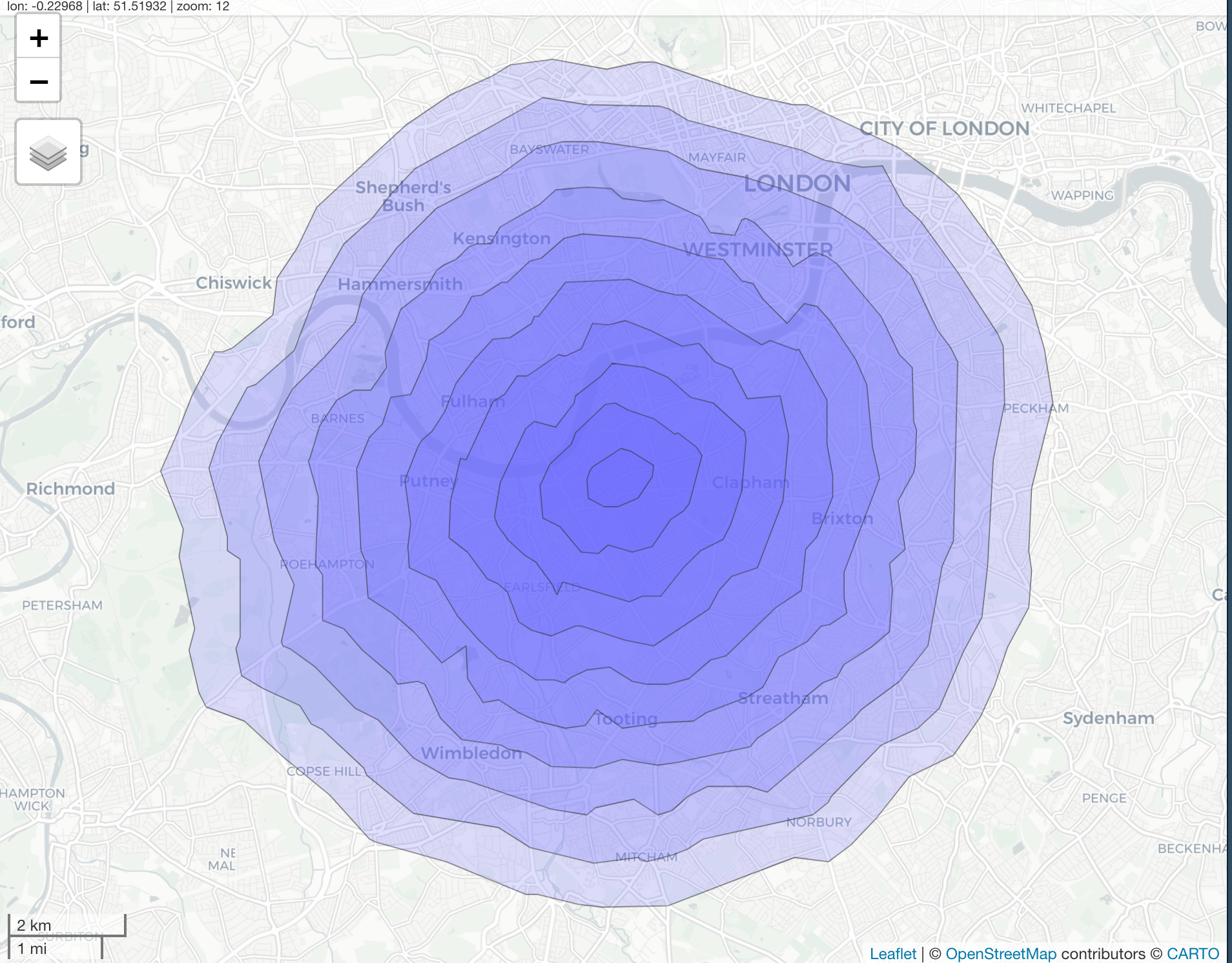
We can use the mapview() function from the {mapview} package to produce an interactive leaflet map to help visualise the isochrones. I found this was also useful to make a note of the approximate maximum/minimum latitude and longitude for our final map.
mapviewOptions(fgb = FALSE)

intervals <- levels(factor(cj_iso$value))
cj_iso_list <- split(cj_iso, intervals)
cj_iso_list <- cj_iso_list[rev(intervals)]

names(cj_iso_list) <- sprintf("%s_min", as.numeric(names(cj_iso_list))/60)

mapview(cj_iso_list, alpha.regions = 0.2, homebutton = FALSE, legend = FALSE)
Unfortunately I cannot get an interactive leaflet to run on my website, but here is a static image of what the mapview() function will produce:
Step 2: Build background map
Now we need to obtain the data required plot our map (i.e. roads, streets, pathways, etc). This is very similar to my week 33 #TidyTuesday submission, and as I mention in the script for my #TidyTuesday submission, much of the code is adapted from great tutorials by Taras Kaduk, ggplot2tutor, and Josh McCrain. I highly recommend looking at these links for a more thorough explanation of street map building in R.
To start, let’s set the limit for our map (i.e. the maximum and minimum values of latitude and longitude). Remember above I said the mapview map is useful for this!
x <- c(-0.287, -0.061)
y <- c(51.39, 51.55)

custom_wandsworth <- rbind(x,y)
colnames(custom_wandsworth) <- c("min", "max")
To obtain our data for the background map, we will use the package osmdata, which allows us to access data from OpenStreetMap (OSM) in vector form. What we need for our code to do is basically query OSM data from the web, state what features (something that can be mapped, see the OSM wiki for more info) we want, and tell osmdata how we want to save all this mappy goodness.
streets <- custom_wandsworth %>%
  opq() %>%
  add_osm_feature(key = "highway",
                  value = c("motorway", "primary",
                            "secondary", "tertiary",
                            "trunk", "secondary_link", "tertiary_link",
                            "residential", "living_street",
                            "unclassified",
                            "service", "footway")) %>%
  osmdata_sf()
Here we are providing our custom_wandsworth matrix and piping it through:
opq(): to build an Overpass query (i.e. query OSM data from the web)add_osm_feature: where we state what features we want:- features are represent as
key-valuepairs. All roads, paths, etc are designed thekey = highwayfor example. Again, the map features page is great for this.
- features are represent as
osmdata_sf()enables us to return the query as an osmdata object insfformat.
The above code has given us all the roads, paths, and streets we could ever dream of in our little corner of London. For simplicity, I will now refer to all of these “highway” values as streets.
From the earlier leaflet map, we know that we could produce a map of Clapham Junction and add the isochrones as shapes on top of the map, however to replicate Maria’s map we want the individual streets to be coloured according to the isochrones. To do this we effectively want to “crop” our street data so that we have separate geometries for streets within each isochrone.
To do this, I have created the little function below. In a nutshell, this finds the difference between consecutive isochrones (i.e. 30 mins and 40 mins) and crops our street coordinates to match this.
rep.x <- function(i, na.rm=FALSE) {

  if(i == length(cj_iso_list)) {streets$osm_lines %>% st_intersection(cj_iso_list[[i]])}

  else if(i < length(cj_iso_list)) {streets$osm_lines %>% st_intersection(st_difference(cj_iso_list[[i]], cj_iso_list[[i+1]]))}

}
We can then apply this function to each element of our cj_iso_list list (where each element is an isochrone) using the lapply() function. We can then extract each of the individual isochrone of the list if we wanted to (and plot lots of individual geoms for each isochrone), though a more concise way is running the function bind_rows() from the dplyr() package, which splits a list into a data frame.
list_df <- lapply(1:length(cj_iso_list), rep.x)

iso_df <- dplyr::bind_rows(list_df)
Step 3: Plotting the final map
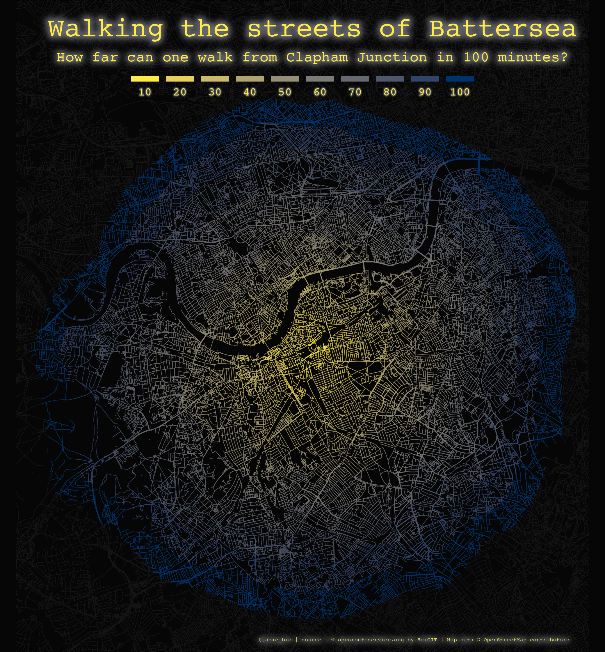
I recently came across the wonderful {paletteer} package, which provides a really easy way to obtain the hex codes of popular colour palettes in R. We use the paletteer_c() function to obtain 10 hex codes (for the 10 isochrones) of the palette ocean.tempo from the package {pals} and save this as a vector of colours, colpal. What is really neat about {paletteer} is that you can see the colourised hex colours when you call the colour vector in RStudio.
colpal <- rev(paletteer_c("pals::ocean.tempo", 10))We can now finally plot our map using {ggplot2}. There is a lot of customisation that can be done in {ggplot2}, so I will only go over the key functions and arguments included here:
- We use the function
geom_sf()to plot our simple feature objects (our streets and isochrone-streets). - We map the colour of each isochrone-street region to a colour from our palette (i.e.
colour = colpal) - We use the function.
coord_sf()to set the limits of our plot. - Nice neon-glow is added to our text with the
with_outer_glow()function from{ggfx}.
save.image(file = "./data/map.RData")ggplot() +
geom_sf(data = streets$osm_lines,
color = "#151515",
size = .2) +
geom_sf(data = iso_df,
aes(colour = as.factor(value),
geometry = geometry),
fill = "#060606",
size = .2,
alpha = .8) +
scale_colour_manual(values = rev(colpal),
labels = seq(10,100,10),
guide = guide_legend(override.aes = list(fill = rev(colpal), alpha = 1),
nrow = 1,
keywidth = 1.5,
keyheight = 0.3,
title.position = "top",
label.position = "bottom",
label.hjust = 0.5)) +
coord_sf(xlim = custom_wandsworth[1,],
ylim = custom_wandsworth[2,],
expand = FALSE) +
with_outer_glow(annotate(geom = "text", label = "Walking the streets of Battersea",
x = -0.17, y = 51.543, size = 7.5, hjust = 0.5, colour = colpal[10], family = "mono"),
colour = colpal[4], sigma = 10, expand = 10) +
with_outer_glow(annotate(geom = "text", label = "How far can one walk from Clapham Junction in 100 minutes?",
x = -0.17, y = 51.536, size = 4, hjust = 0.5, colour = colpal[10], family = "mono"),
colour = colpal[4], sigma = 10, expand = 7) +
with_outer_glow(annotate(geom = "text", label = "@jamie_bio | source = © openrouteservice.org by HeiGIT | Map data © OpenStreetMap contributors",
x = -0.13, y = 51.393, size = 1.5, hjust = 0.5, colour = colpal[10], family = "mono"),
colour = colpal[4], sigma = 10, expand = 4) +
theme_void() +
theme(plot.background = element_rect(fill = "#060606"),
panel.background = element_rect(fill = "#060606"),
legend.text = with_outer_glow(element_text(colour = colpal[10],
family = "mono"),
colour = colpal[4], sigma = 2, expand = 3),
legend.title = element_blank(),
legend.position=c(0.5, 0.85),
legend.justification = "bottom",
legend.direction = "horizontal")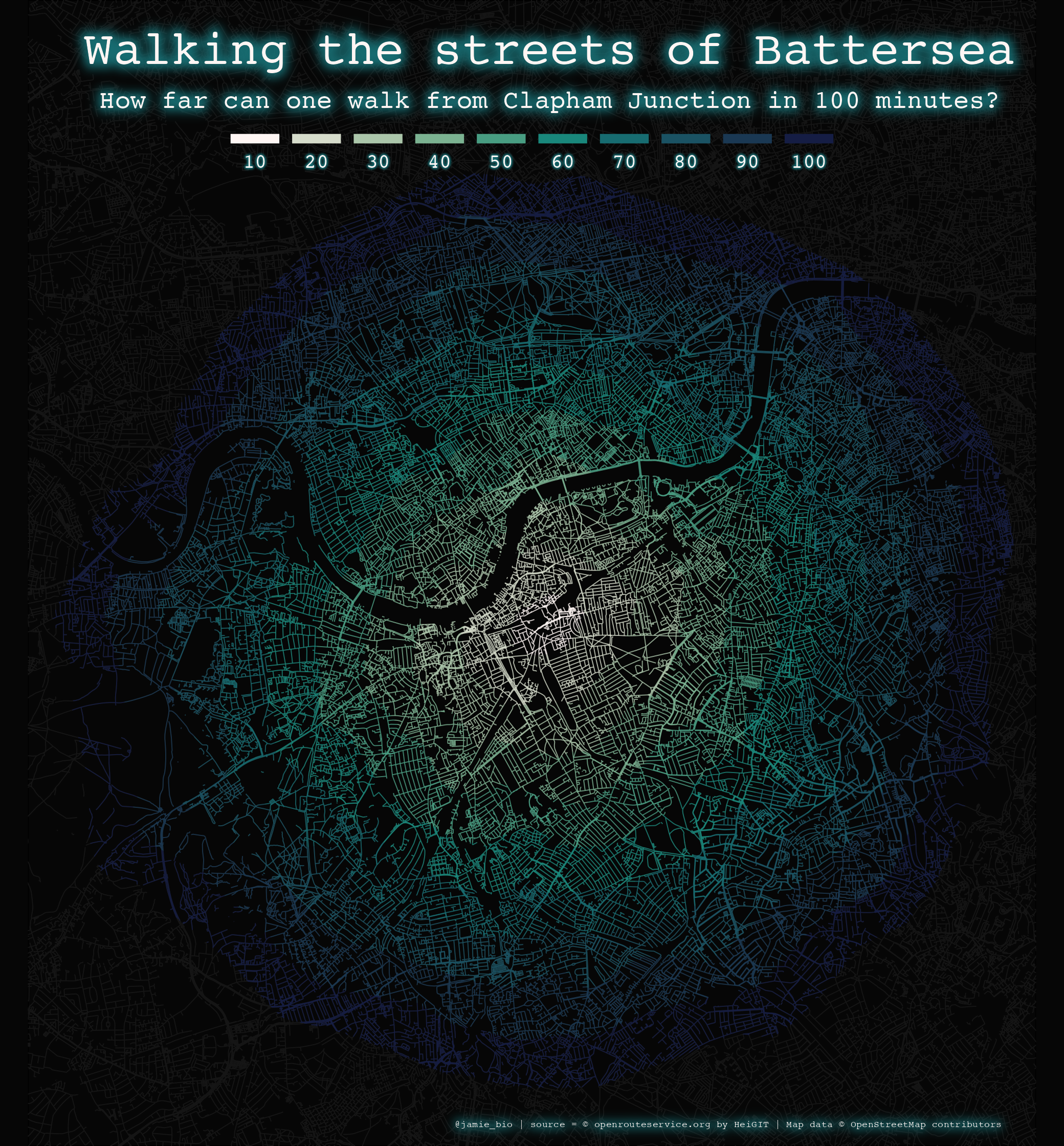
And obviously we can change the colour palette to suit individual preferences (I really like the original colour scheme from Maria’s image, which I think is the magma palette of {viridis}), though for example here is the cividis palette from the {viridis} package.