Data visualisation
I love the different ways we can present data. Whilst academic data visualisation is often based on enabling readers to accurately perceive the absolute values of the data, and hence make inferences, there is obviously merit in making visualisations that are aesthetically pleasing and engaging. As I have developed coding-based skills through my academic work, I have tried to use these skills to help with computerised data visualtions.
On this page
TidyTuesday 💻
TidyTuesday is a weekly project produced by the R4DS Online Learning Community where each week a raw datset, chart, or article is posted. One is then able to tidy and explore the data, and produce an informative(?) visualisation.
An important aspect of TidyTuesday is this, taken directly from the TidyTuesday website:
We will have many sources of data and want to emphasize that no causation is implied. There are various moderating variables that affect all data, many of which might not have been captured in these datasets. As such, our guidelines are to use the data provided to practice your data tidying and plotting techniques. Participants are invited to consider for themselves what nuancing factors might underlie these relationships.
TidyTuesday is a bit of fun, and is often used to learn and improve R skills, data visualation techniques, and connect with the R community!
My GitHub with all of my contributions:
2021 week 44 - Ultra trail running 🏃♀️
Ultra trail data courtesy of Benjamin Nowak by way of International Trail Running Association (ITRA)

2021 week 43 - Giant pumpkins 🎃
Giant pumpkin data from BigPumpkins.com


2021 week 42 - Global Seafood 🐟
Global fishing data from OurWorldinData.org

2021 week 41 - US registered nurses 🏥
US Nurse data from Data.World

2021 week 39 - Emmy awards 🏆
Emmy award data from emmys.com

2021 week 38 - US Billboard 100 🎼
US Billboard data from Data.World by way of Sean Miller, Billboard.com and Spotify

2021 week 37 - Formula One 🏎


2021 week 36 - Australian bird baths 🦜
Bird bath data from Cleary et al., (2016) PLOS ONE 11(3): e0150899

2021 week 35 - Lorises 🙉
Strepsirrhine primate data from the Duke Lemur Center

2021 week 34 - Star Trek voice commands 🚀🖖
Star Trek voice commands data from the SpeechInteraction.org

2021 week 33 - BEA Infrastructure investment 💰
U.S. Infrastructure investment data from the Bureau of Economic Analysis

2021 week 32 - Paralympics 🏅🇮🇪
Paralympics data from the International Paralympic Committee

2021 week 31 - Olympics 🏅
Olympics data from Kaggle


2021 week 30 - US Droughts 🌵
Data of US droughts from U.S. Drought Monitor

2021 week 29 - Scooby Doo episodes 🐕👻
Scooby Doo episode data from Kaggle thanks to manual data aggregation by plummye

2021 week 28 - Independence days 🌍🎆
Independence Days data from Wikipedia thanks to Isabella Velasquez

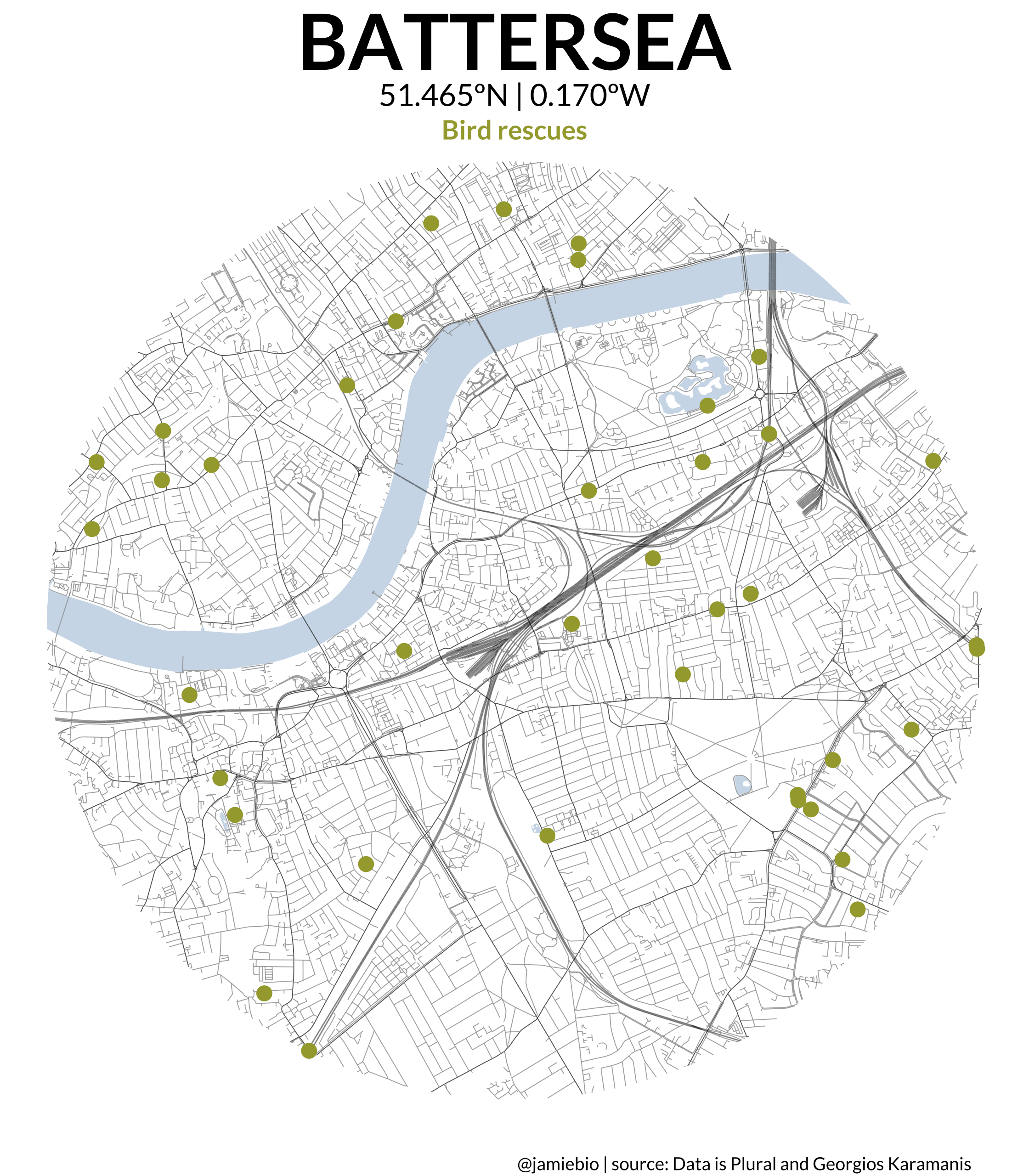
2021 week 27 - London animal rescues 🐱🐶🇺🇸
Animal rescue data from London.gov by way of Data is Plural and Georgios Karamanis
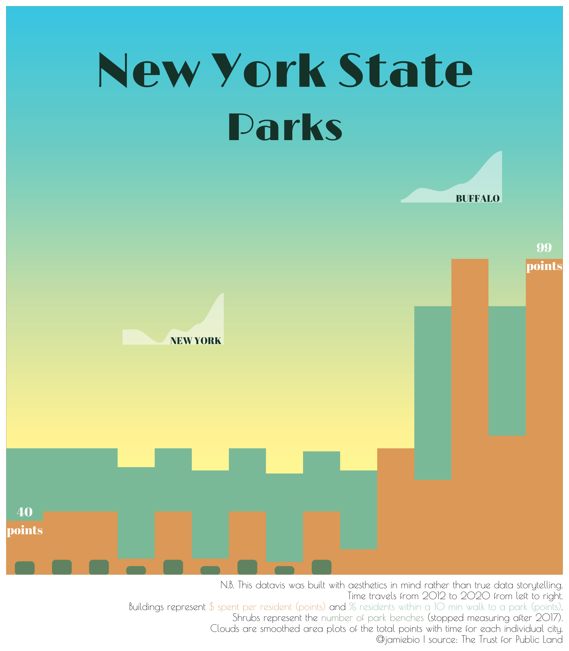
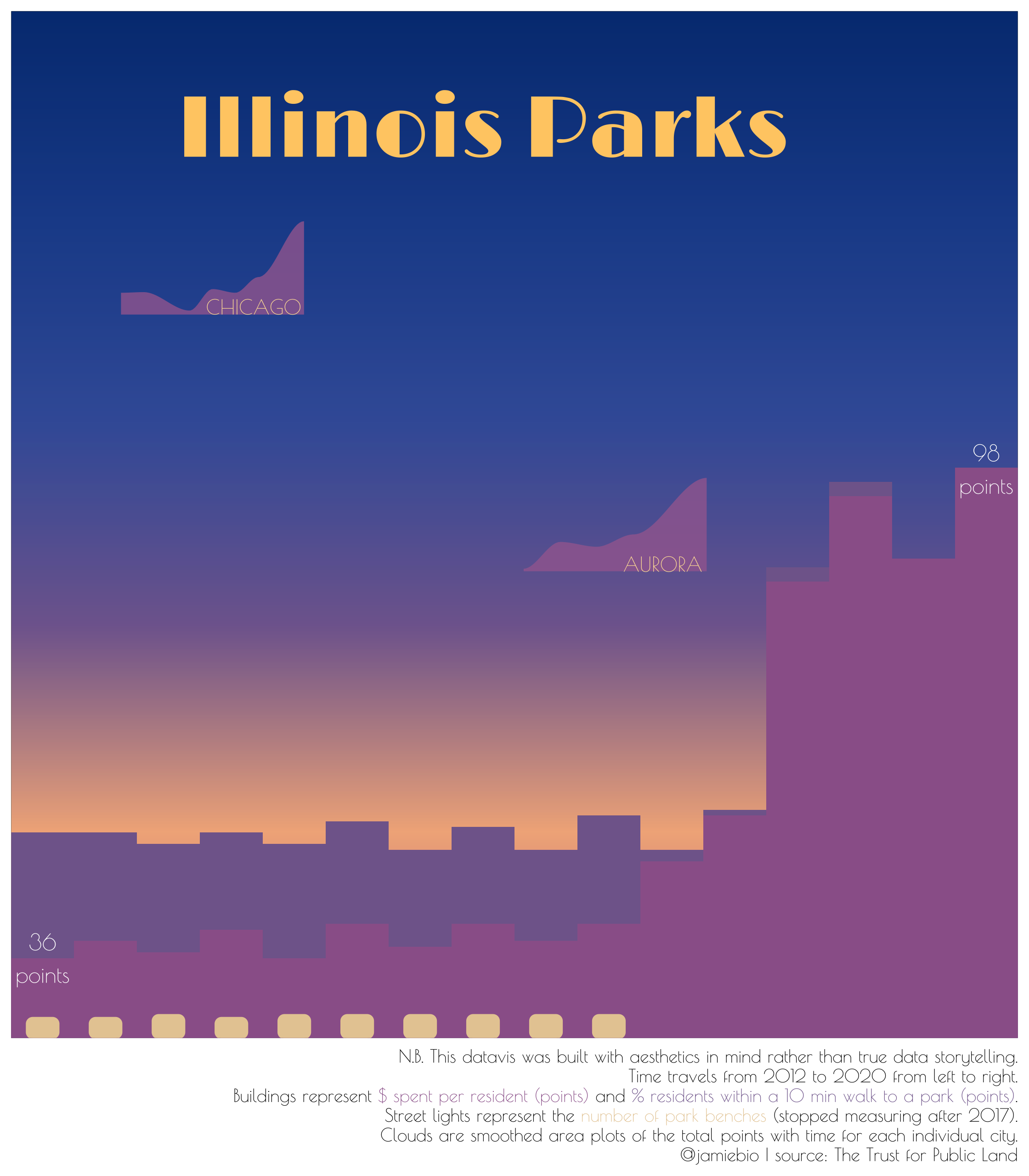
2021 week 26 - US Public Park access 🌳🇺🇸
Park access data from The Trust for Public Land
2021 week 25 - #DuBoisChallenge tweets ✊🏿
#DuBoisChallenge data from Anthony Starks, Allen Hillery, and Sekou Tyler

2021 week 24 - Great Lakes Fisheries 🎣
Fishery data from Great Lakes Fishery Commission
2021 week 23 - Survivor TV Show 📺🏝
Survivor data from Daniel Oehm who produced the {survivoR} package

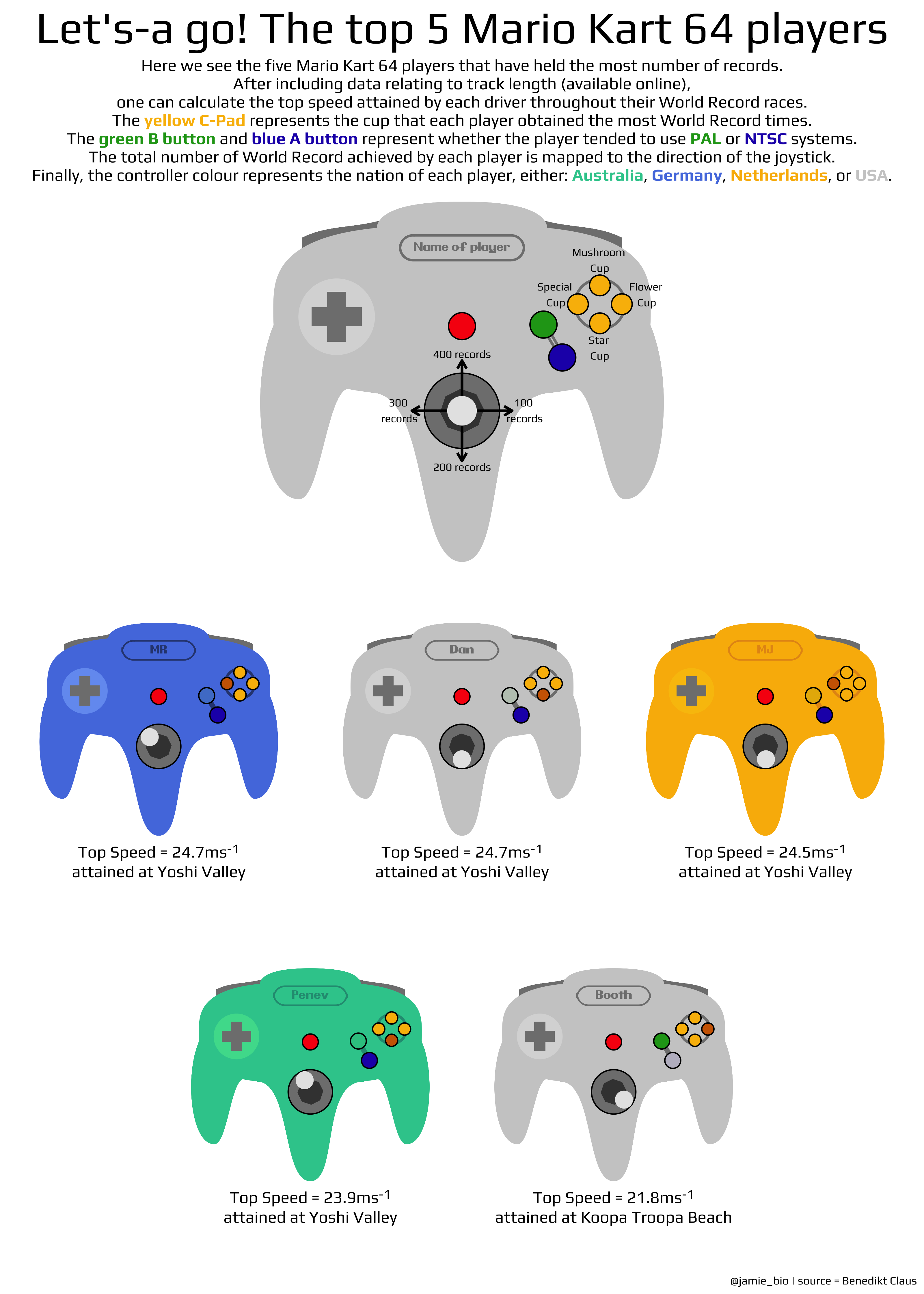
2021 week 22 - Mario Kart 64 🏎🏁
Mario Kart 64 World Records from Benedikt Claus & MKWR
2021 week 21 - Salary survey 💰
Salary survey data from Ask a Manager

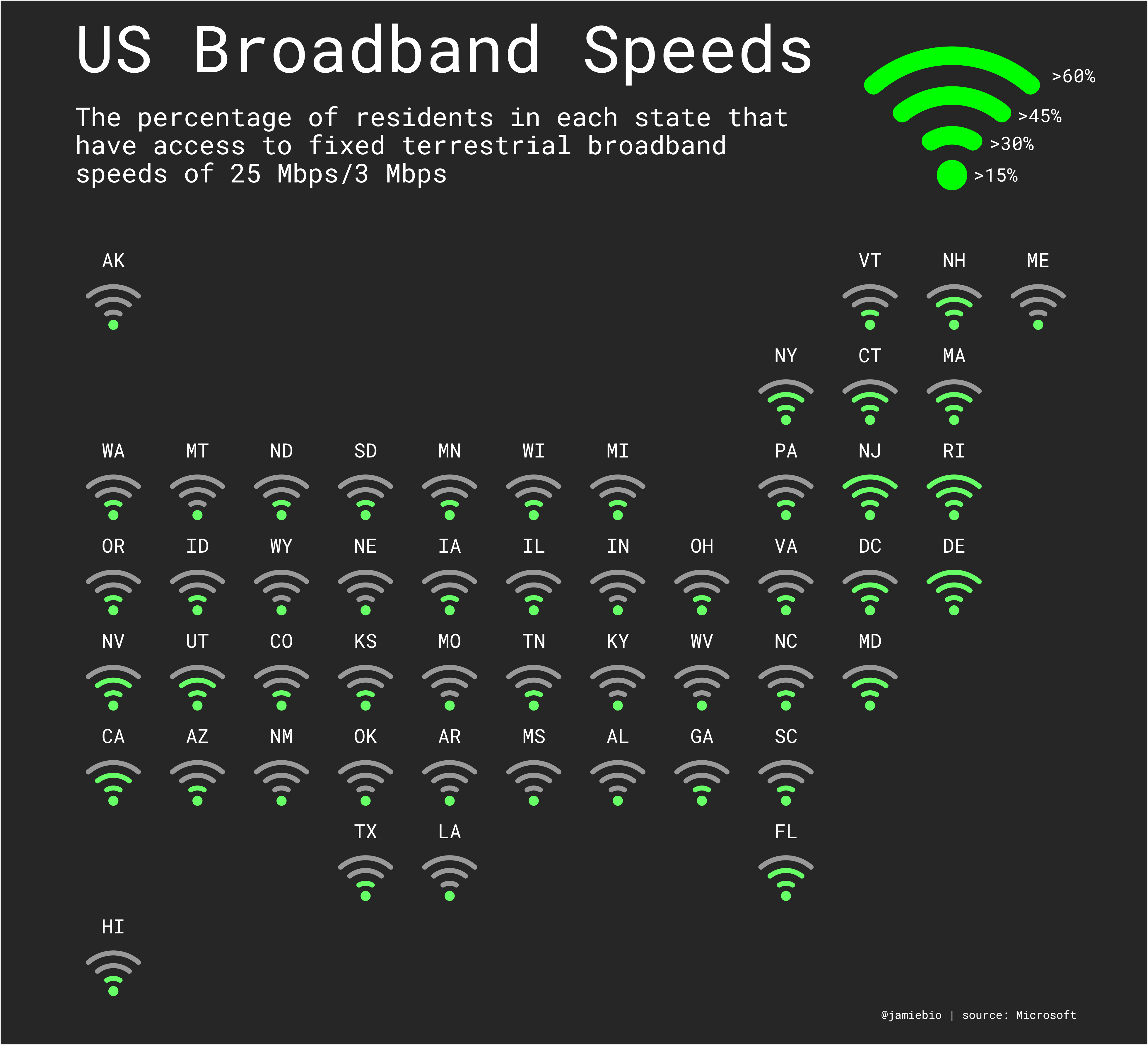
2021 week 20 - Internet usage 💻
US internet usage data from Microsoft
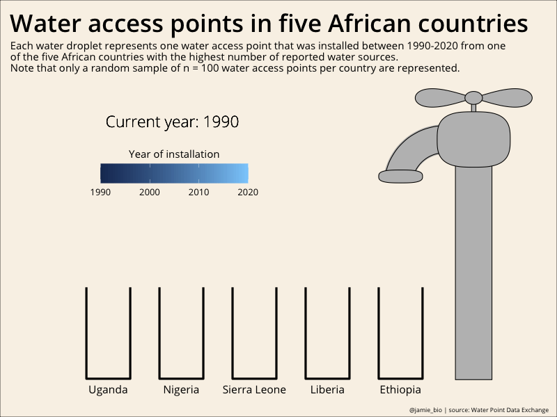
2021 week 19 - Water sources 💦
Water access points data from Water Point Data Exchange
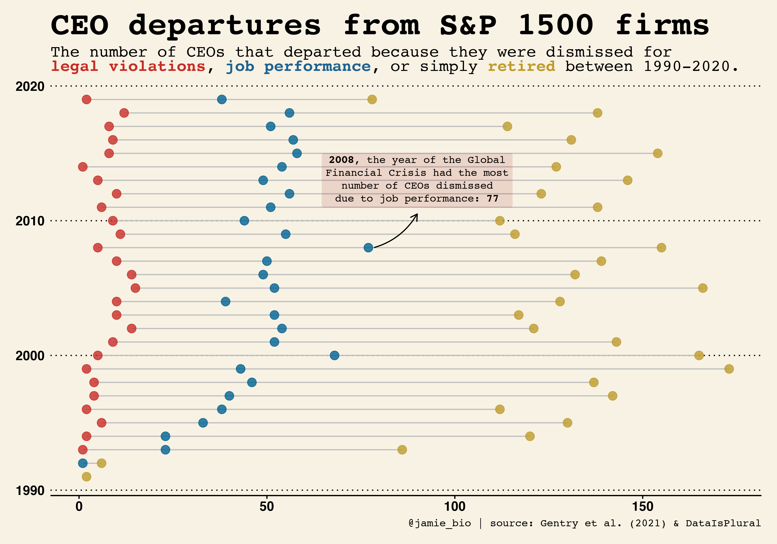
2021 week 18 - CEO departures 📊
CEO departure data from Gentry et al. 2021 & DataIsPlural
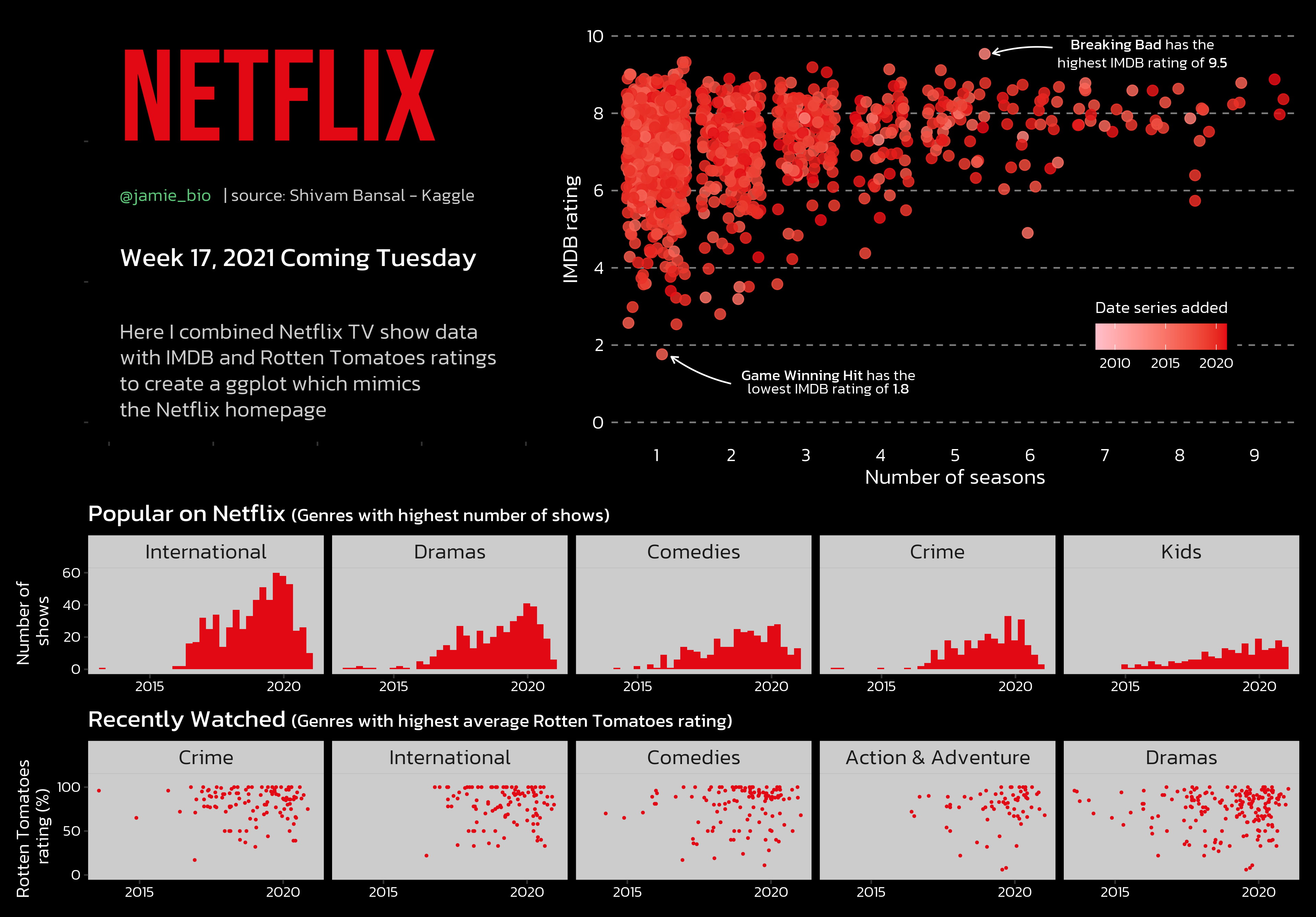
2021 week 17 - Netflix Titles 📺
Netflix show data from Shivam Bansal (Kaggle)
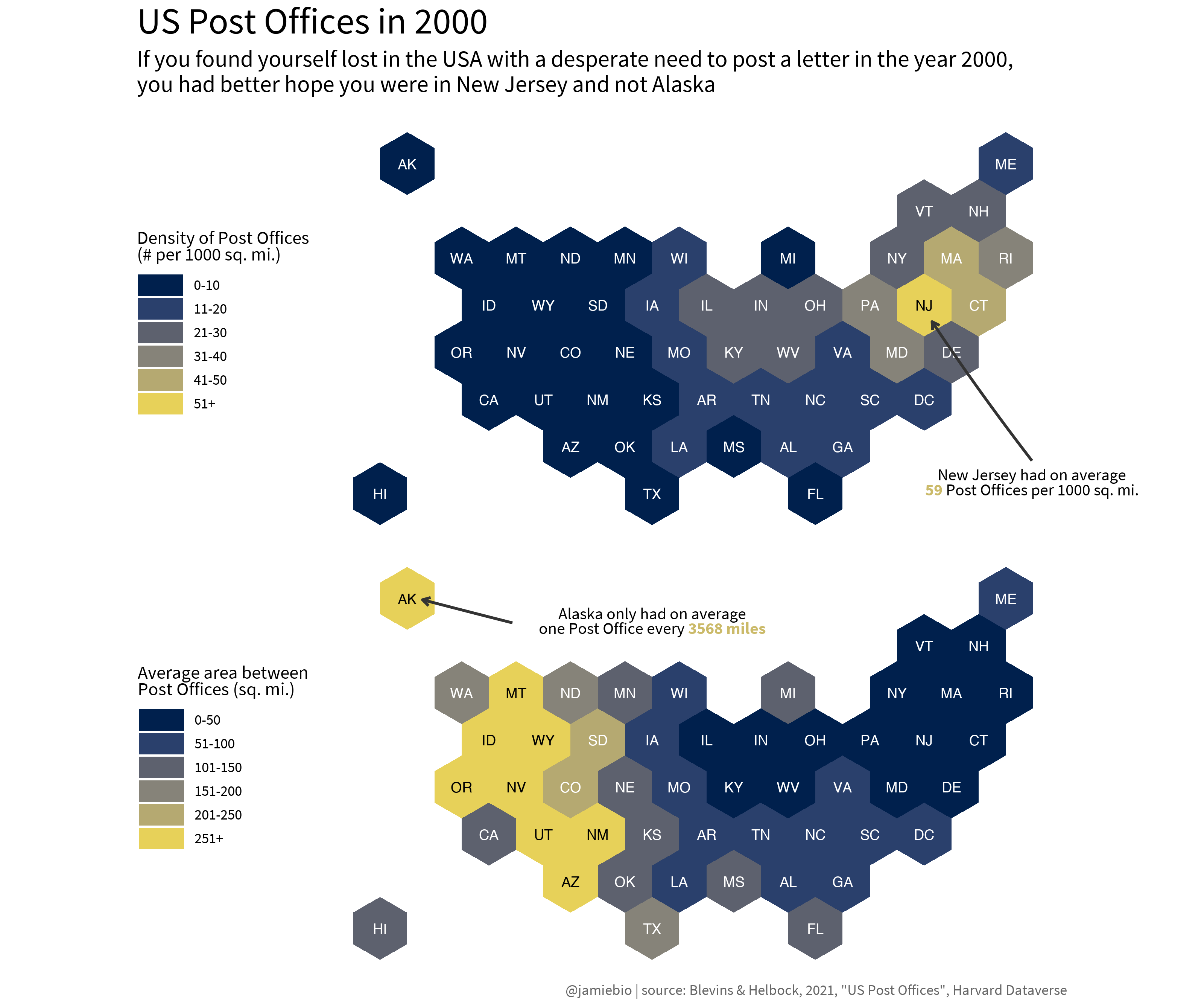
2021 week 16 - US Post Offices ✉️📪
US Post Office data from Blevins & Helbock, 2021, "US Post Offices", Harvard Dataverse
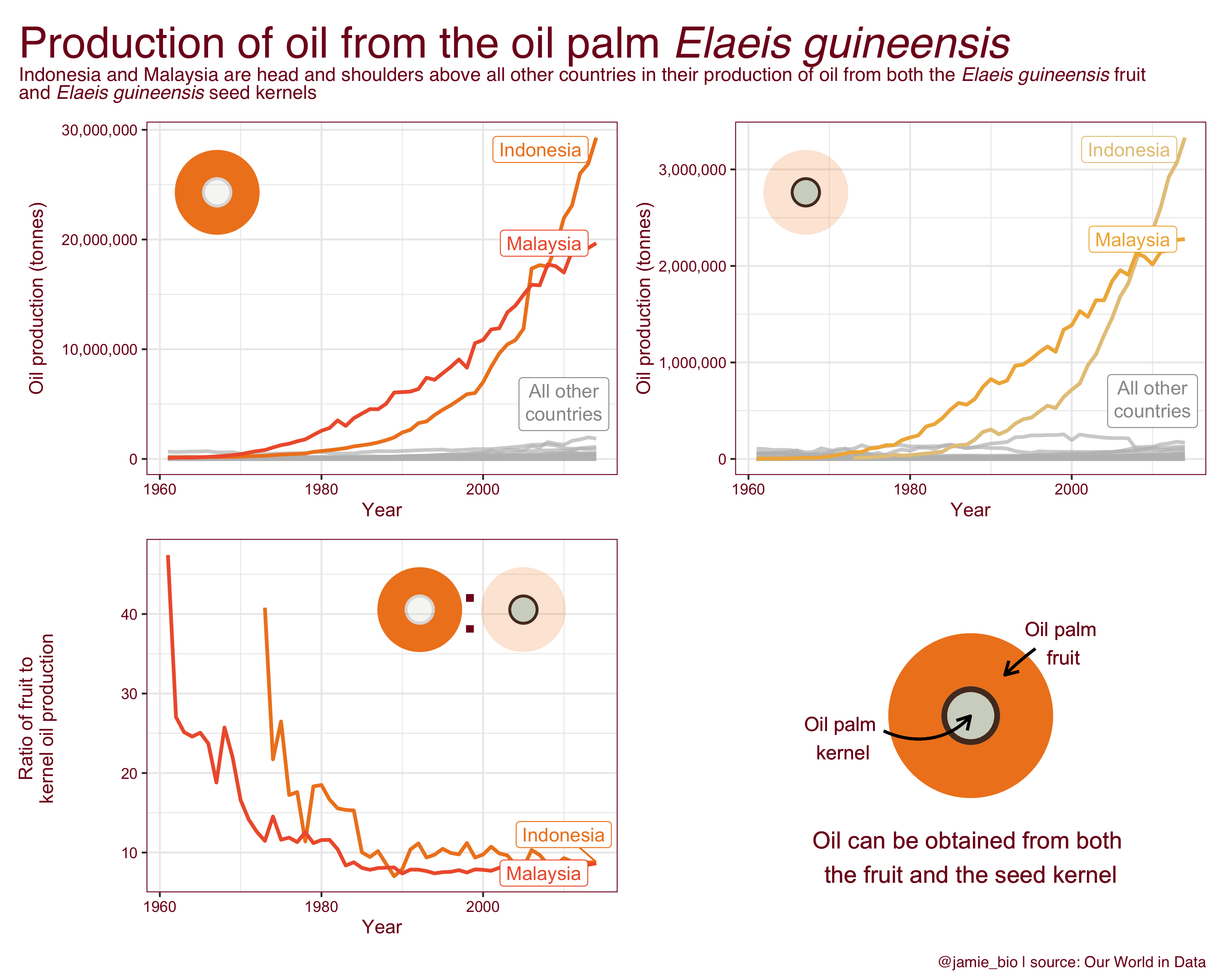
2021 week 15 - Deforestation 🌳🪵
Deforestation data from Our World in Data
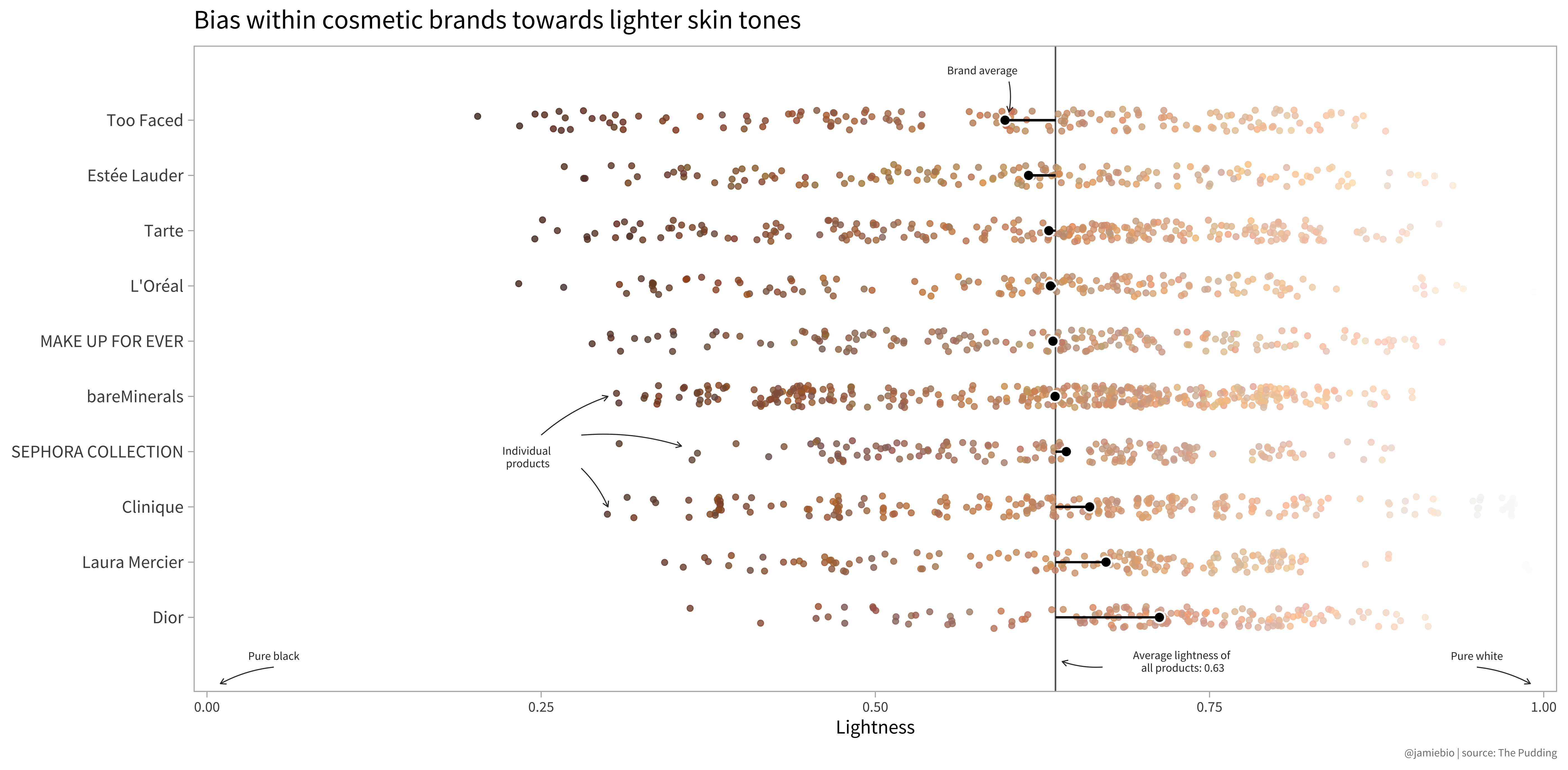
2021 week 14 - Make up shades 💄
Makeup shades data from The Pudding | See original article here
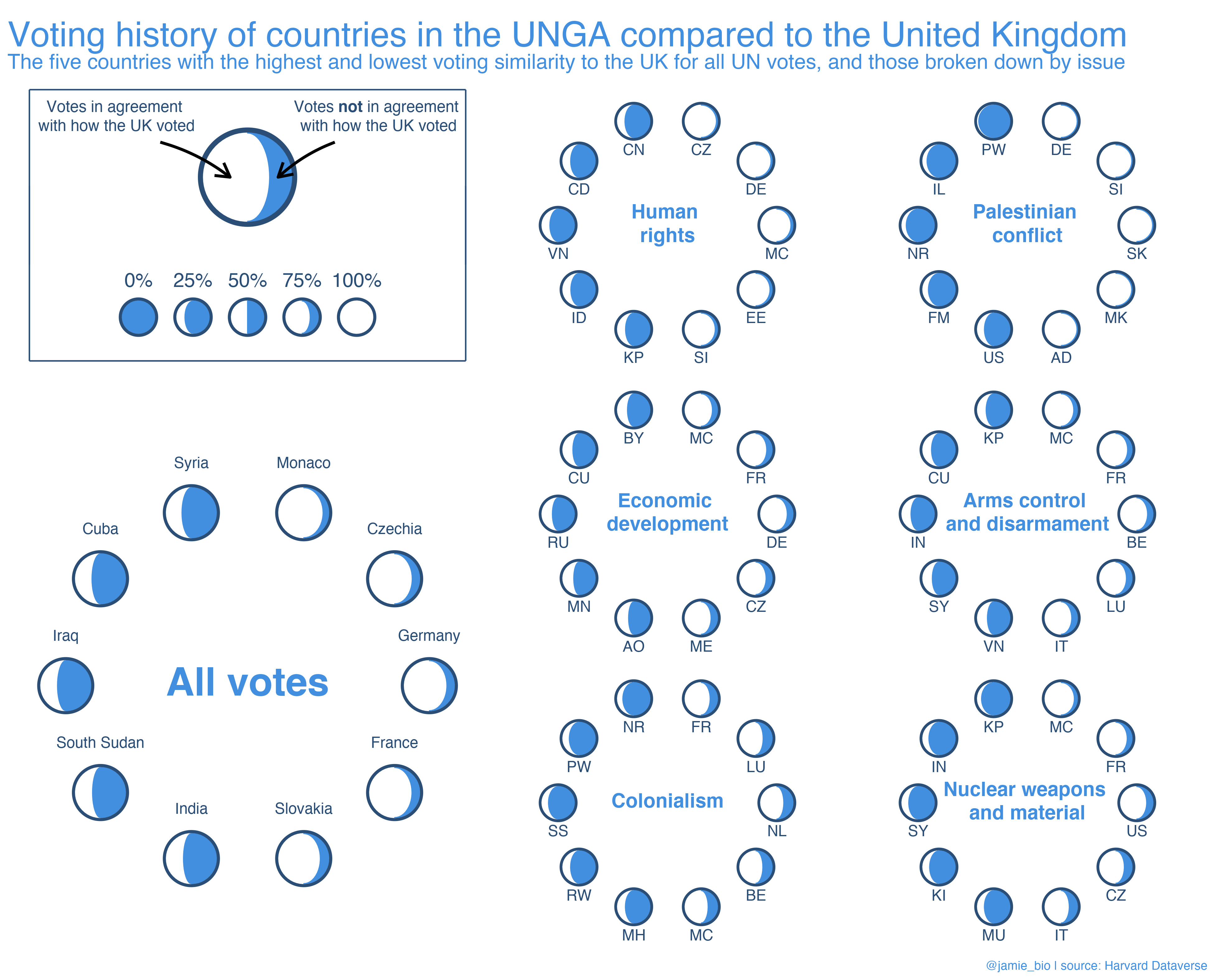
2021 week 13 - UN votes 🌐🌍
UN voting data from Harvard Dataverse
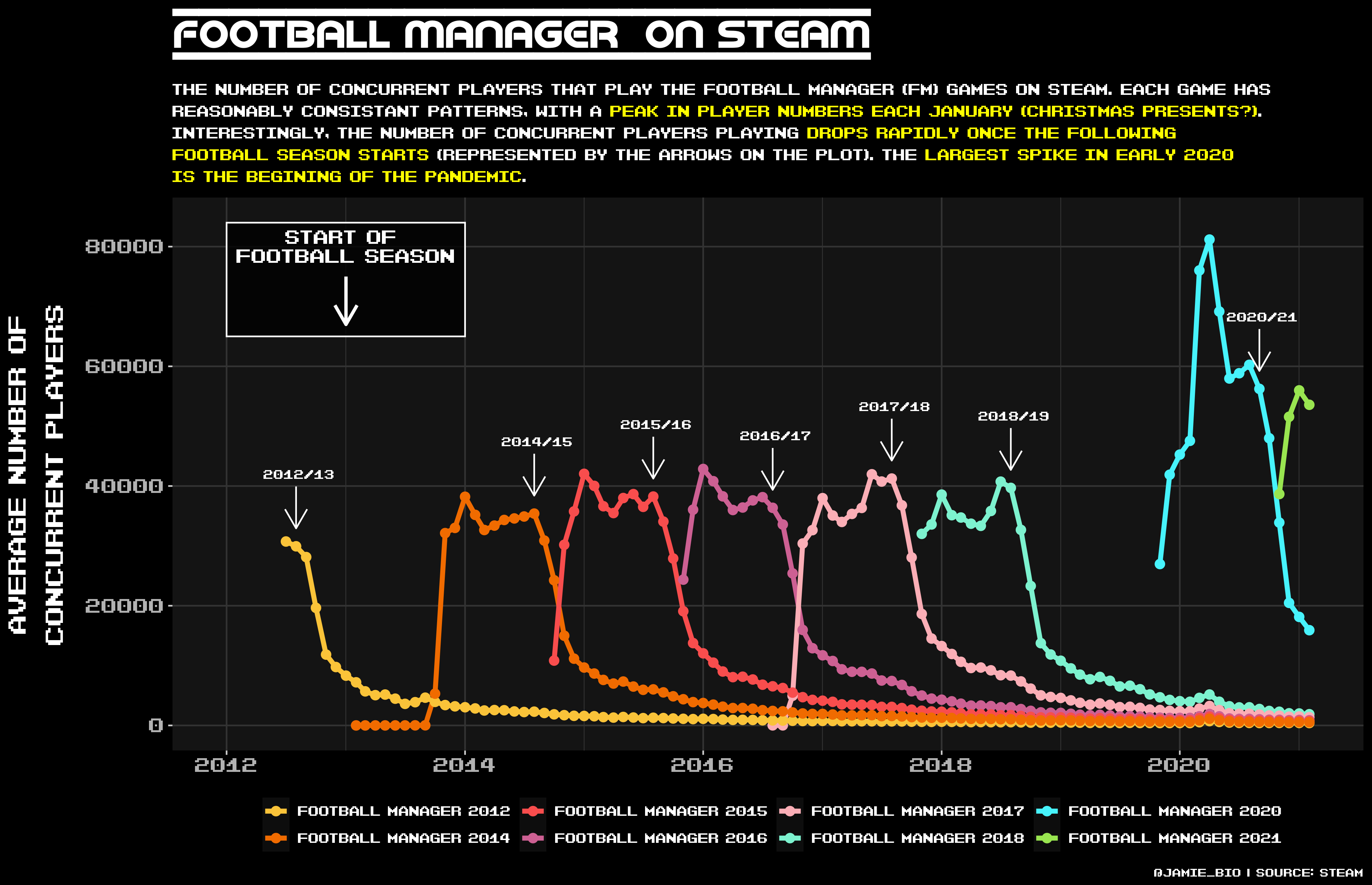
2021 week 12 - Video Games 👾
Video game data from the video game distribution service Steam
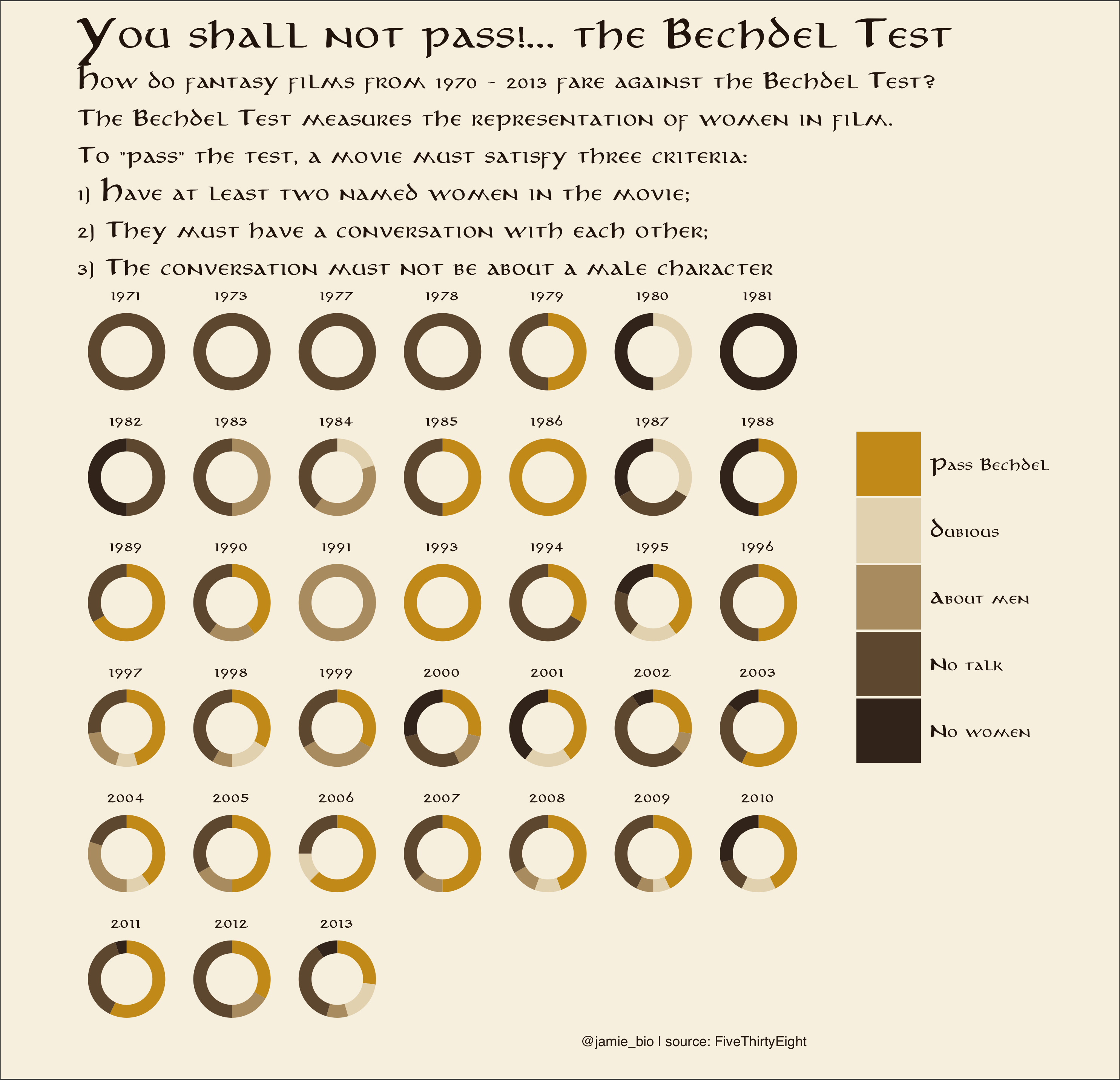
2021 week 11 - Bechdel Test 🎥🙋♀️
The Bechdel test is a measure of the representation of women in fiction
Football data ⚽
I have produced an R Shiny App with an updating 2021 / 2022 Premier League Table
With this, you can view:
-
The Premier League Table at a set date
-
The Premier League Table between two dates - the media love to do this to see, for example, the table since Christmas or since a managerial sacking
-
A lineplot of the weekly league position for each team
-
A lineplot of the total number of points attained by each team, on a weekly basis.
The previous version for 2020/21 can be found here: Premier League Table
Please note that I only have a free shinyapps account, so use is limited to 25 active hours per month
Pokémon
There is a plethora of Pokémon data visualisation online, with much providing informative insights on specific Pokémon stats (HP, Attack, Sp. Atk etc). I thought it would be interesting to visualise the different “type” that each Pokémon is.
I downloaded a dataset from Kaggle that contains the typing of each Pokémon (some Pokémon have two types), and used {geom_tile} to produce a tile representing each Pokémon, where the colour of the tile maps to each Pokémon’s typing.